Viva Aerobus

Sales main flow architecture
Design and visual standardization of the interface
Interactive hi-fi prototype
We developed a functional prototype that optimizes user flow, making navigation easier and enhancing the purchasing experience. This improvement significantly increased the number of tickets sold.
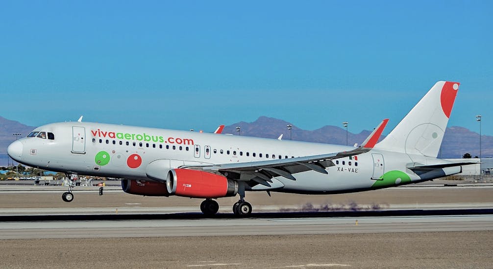
Viva Aerobus is a Mexican airline based at Monterrey International Airport. It operates 164 routes to 58 destinations, offering service to 41 national cities and 11 cities in the United States.

Improving user’s experience to enhance the sales flow in their mobile app.
Viva Aerobus approached ADHOC TI with the goal of improving the user experience on their mobile app to increase flight sales. Our proposal focused on optimizing the sales flow within the mobile application, facing several challenges:
Designing a clear and understandable user flow.
Standardizing the visual proposal to cohesively present the information.
Developing a usable prototype with realistic data.
User flow architecture
Our first objective was to reorganize the user flow in the purchasing process, allowing users to know at all times which stage they were in.

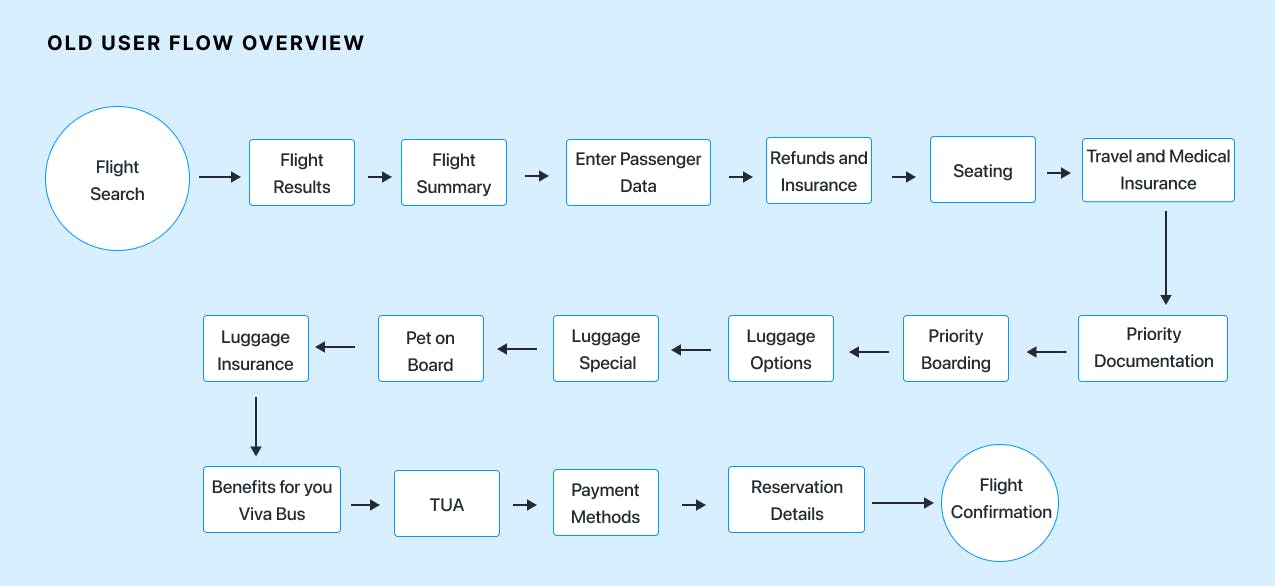
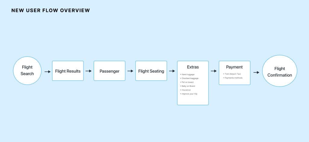
We designed key components that guide the user towards their goal.

Interface design and interactions:
We defined the structure of the main flow and focused on three crucial parts:
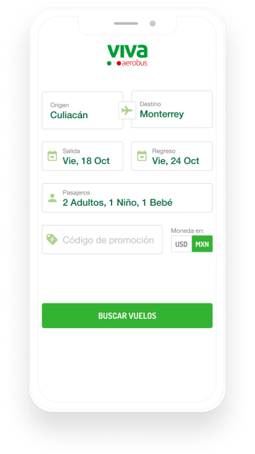
Flight Search and Calendar: We designed a calendar that clearly shows flight prices and availability.
Flight and Package Selection: We organized the information so that the user can explore flight and package options on a single screen.
Seat Selection: We designed an interface that allows the user to easily select and modify seats.
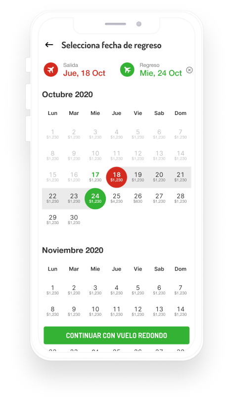
Search engine and flight schedule
We proposed a calendar design that helps users reduce the uncertainty of knowing the cost of a flight when selecting departure and return dates. At a glance, we managed to convey the dates with available flights and their lowest prices. On the same screen, we provided clarity in date selection using colors and contrasts for outbound and return flights, which would be present from this step onward.
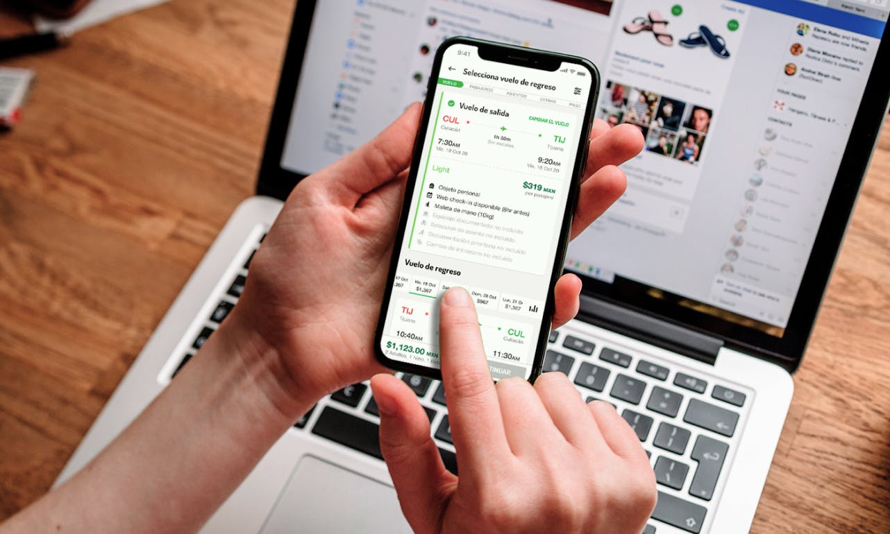
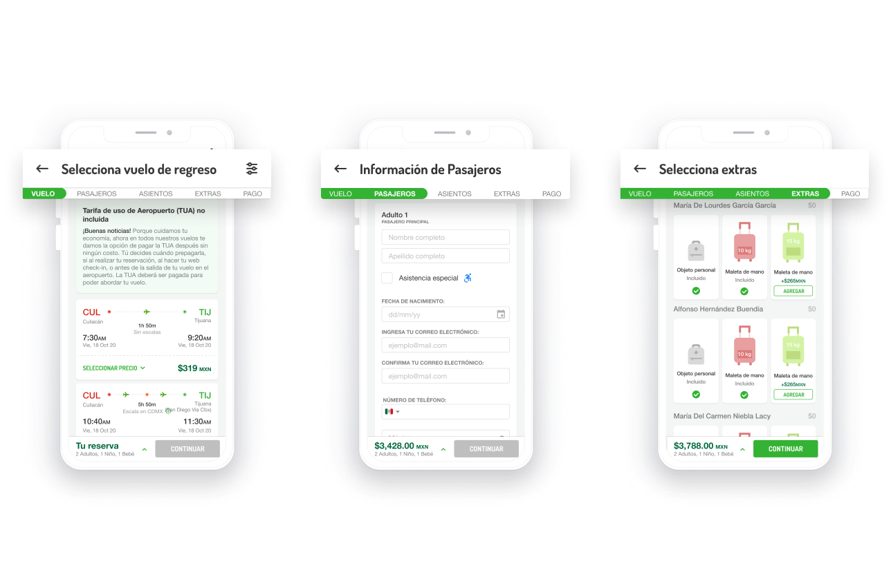
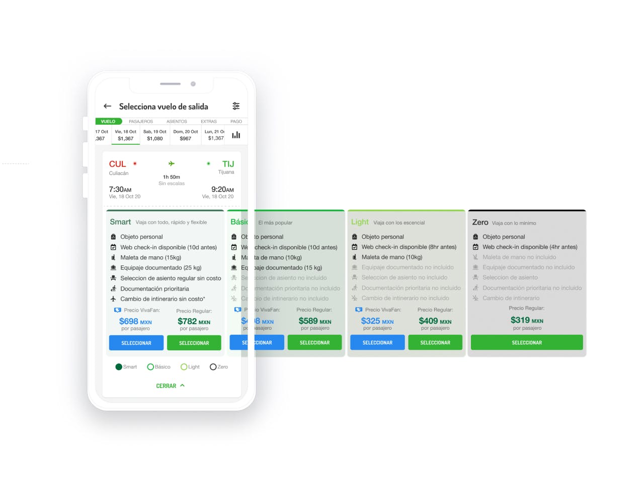
Selection of flights and packages
One of the most important screens is the selection of flight schedules and packages, the main challenge was to allow the user to explore in a clear way and on a single screen a large amount of information related to flight results, with their dates and details.
To achieve this, we defined the arrangement of elements that the layout would have to show all the information in a clear and convenient way for the user.
- The flight results would be arranged from top to bottom, showing outbound flights first and return flights second, neatly divided.
- We show at first glance the most relevant information for each flight, adding actions to see more details.
- We designed package and pricing information to navigate horizontally, giving context to which flight is explored and the features of each package.
This way we managed to make a very condensed screen of information understandable and meaningful to the user.

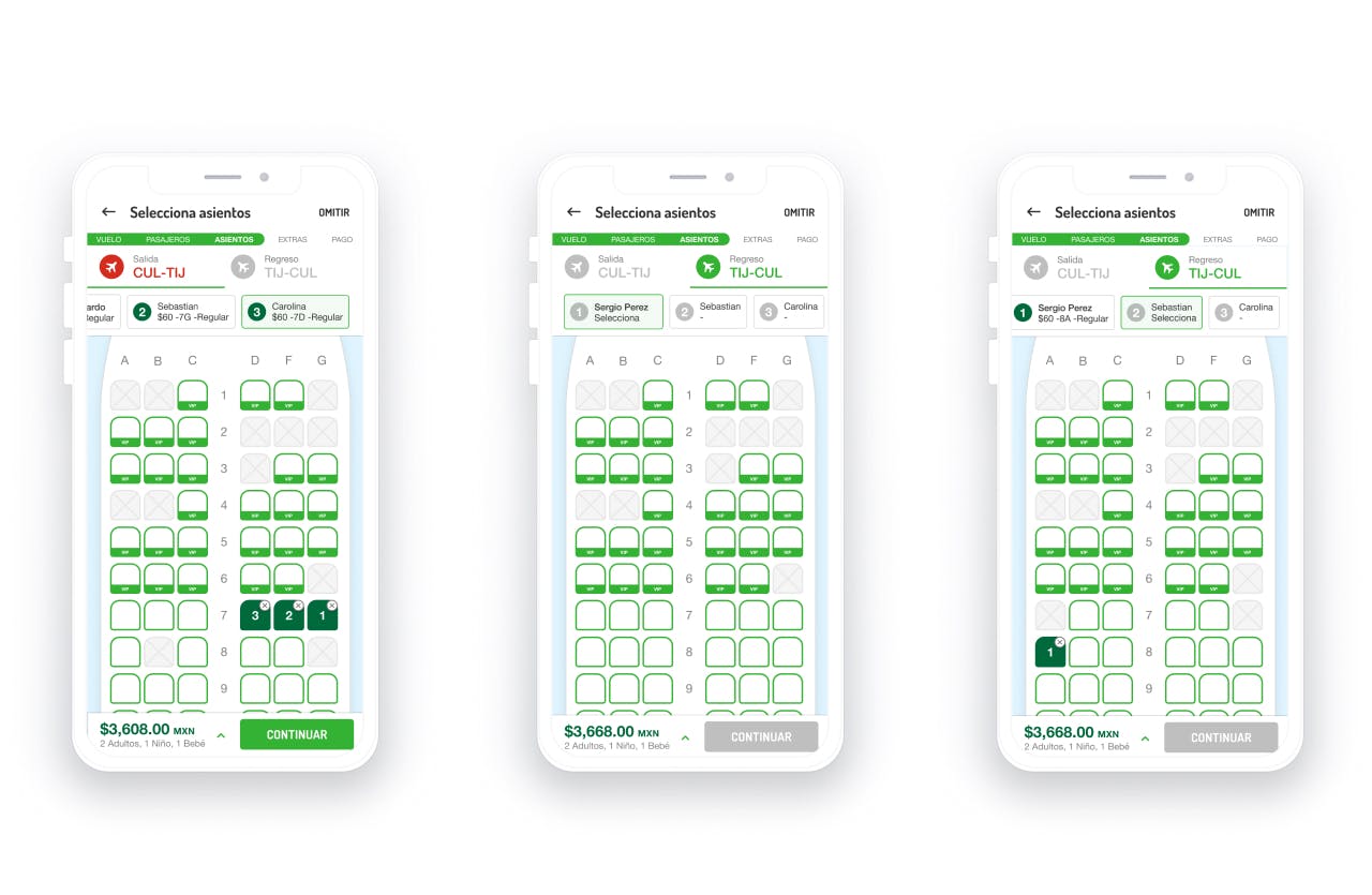
Seat selection
On the seat selection screen, our goal was to design the components so that the user was always aware of the seat they were selecting, for which passenger, and on which flight. This design allowed the user to modify any previous selection if desired.
Prototype development
The prototype development was carried out in parallel with the interface design, using React Native under Expo and MirageJS to simulate an API. This allowed for rapid and efficient development with constant feedback.
React Native + Expo: Facilitated agile development and easy deployment through QR code scanning.
Real-Time Data and API: MirageJS allowed us to simulate real data, enhancing the user experience.
In just 4 weeks, we developed a functional prototype that can be installed on any iOS or Android device. This prototype demonstrates the feasibility and efficiency of our approach to custom development projects.
This project showcased ADHOC TI's ability to significantly enhance user experience and increase sales through mobile applications. The functional prototype serves as a tool to demonstrate to shareholders and executives the opportunities it presents, encouraging investment in the project.